Animating popcorn kernels with the :has() selector
2 min read

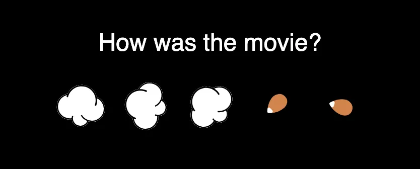
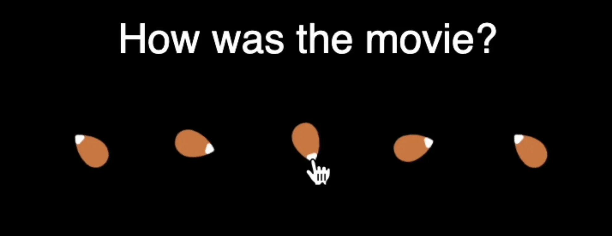
I was working on a star-rating component concept using popcorn for stars. I wanted to animate the kernels, up to the one being hovered on. I wanted to keep this as a CSS solution, but this meant going back in the tree.

I want to select all the labels before the one that is being hovered. Here’s the HTML structure I’m working with:
fieldset
  legend
  div
    label
      input
      kernel svg
    label
      input
      kernel svg
    (+ 3 more)
With the :has() selector now being baseline across browsers, this becomes possible with the following CSS:
label:has(~ label:hover),
label:hover {
  transform-origin: center;
  animation: jiggle 0.1s linear infinite alternate;
}
For a quick refresher on how :has() works, it selects all elements that contain elements that match the provided selector.
It’s really great for going up the tree and selecting parents e.g. selecting all <div>’s that contain a <p>.
But we can also use it to traverse the tree horizontally in reverse by combining it with the
subsequent-sibling combinator (~).
The first selector selects all labels that have a later sibling label that is being hovered. This doesn’t catch the actual element being hovered, so we add in the second selector.
The :has() selector is super powerful, and I love finding new ways to use it!
You can check out the demo for this component on my CodePen.